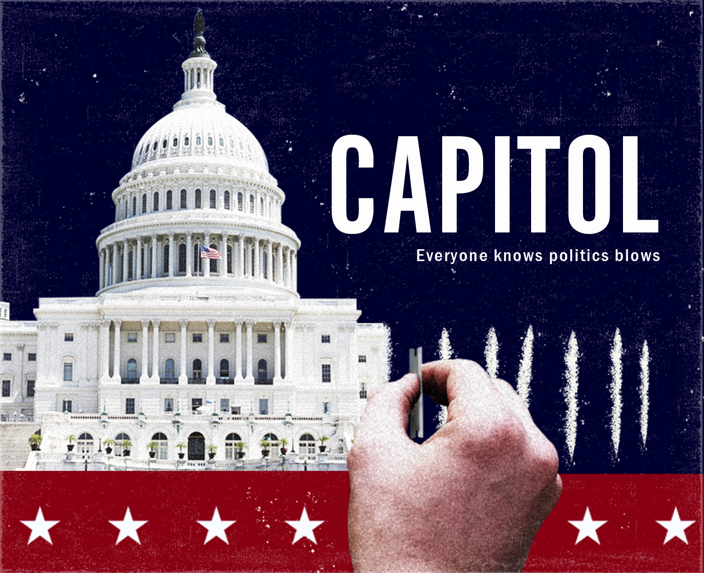
I worked with CK&D, a marketing and cause management firm in Los Angeles, on this graphic for the TV show Capitol. This graphic was to be used as a supplementary visual to the script as it was being sent out to actors and other industry professionals.
The Prompt: I was asked to create a graphic that felt gritty, bold, and represented the central motifs of the show (Capitol building, cocaine, etc.)
This came as the first draft after working and finding a design idea we wanted to run with.
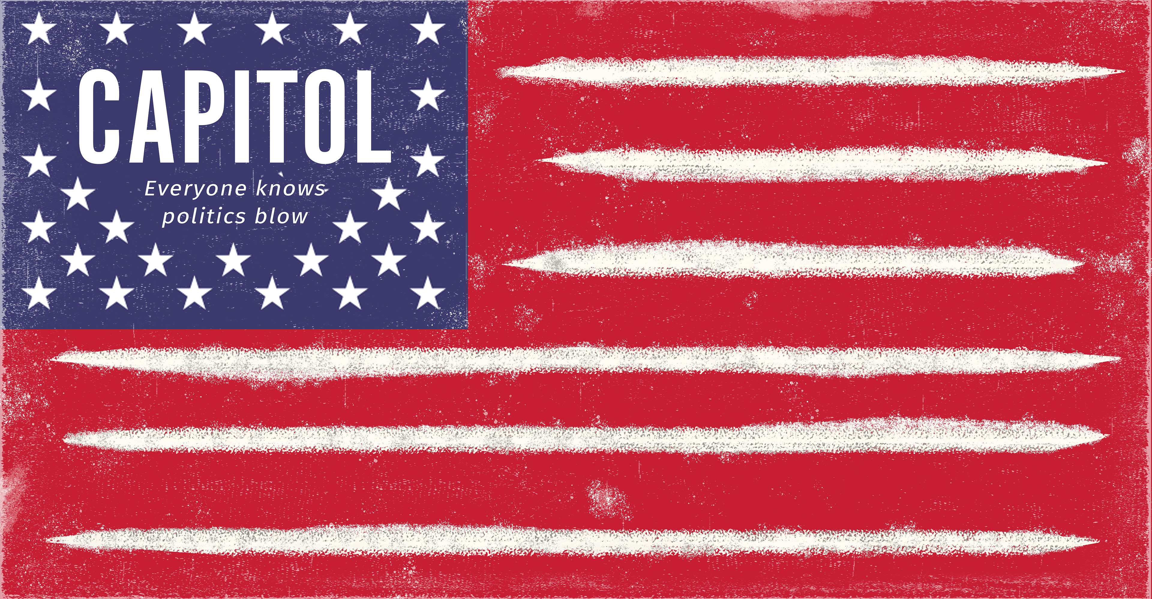
From here, we decided we wanted to try some things out. We wanted a more 70's-80's vibe and to add some cleverness to the main "Capitol" text. We also wanted to see how a pattern looked.
Here's the result

This was clearly too much, and so we decided to go to the previous design and clean it up a bit.
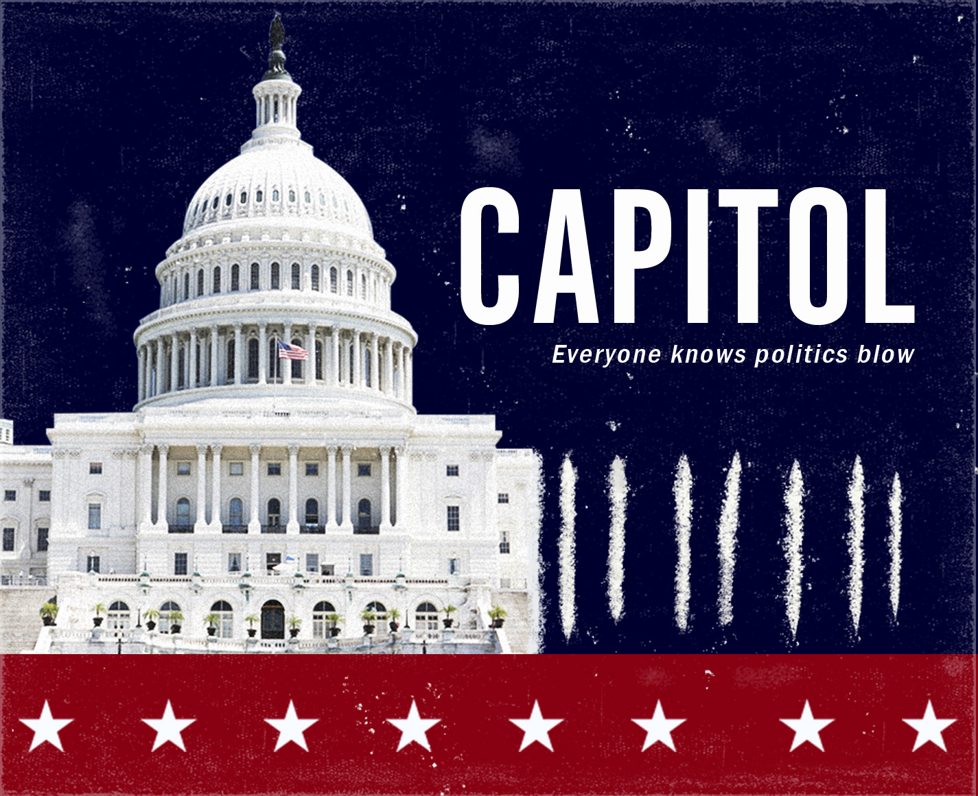
At this point, I was allowed to make another design without any parameters, to see if there was anything else we wanted to try. I came up with the below design. I enjoyed how simple the concept was and how subtly the reality of the show was displayed. This ended up being the final design used for the script!